Official DarkMode
- Thread starter DerDanilo
- Start date
You are using an out of date browser. It may not display this or other websites correctly.
You should upgrade or use an alternative browser.
You should upgrade or use an alternative browser.
Sorry but this is far from being constructive as its opinionated ("looks great" or "doesn't look interesting") and not really providing actual arguments nor actionable suggestions.I will add constructive criticism to the dark theme!
this is a custom dark theme and it looks great
the original one doesn't look that interesting because of those white inserts
Note that we neither wanted to create an interesting theme, as for one that is highly subjective and for another this as for one isn't a movie or game or the like but a "workhorse" GUI for an enterprise class virtualization & cluster stack.
Similar for looks, this is highly subjective, and no theme will be able to cater to all of our users taste in the same way.
Our main goals were:
- Ensure that there's still a high contrast, for accessibility.
- Translate the current light theme to a dark theme for consistency and as that is an established theme we optimized the UI for since years.
So, while it isn't totally out of the question that we might add another theme variant someday, we will only fix accessibility issues (which means mostly contrast) for the new official Proxmox Dark theme.
@t.lamprecht Could you maybe add some info to the official documentation on how to change certain theme aspects that allow e.g. to change colors used?
Nice to have: Is it easy to implement some options in the UI DC config or via config file that allow to set hex values for colours and upload custom logo (or 2nd logo) etc. ?
I know that we can overwrite those but it would be better to have that integrated properly.
Nice to have: Is it easy to implement some options in the UI DC config or via config file that allow to set hex values for colours and upload custom logo (or 2nd logo) etc. ?
I know that we can overwrite those but it would be better to have that integrated properly.
The current dark theme can be found in of our git repo:@t.lamprecht Could you maybe add some info to the official documentation on how to change certain theme aspects that allow e.g. to change colors used?
https://git.proxmox.com/?p=proxmox-widget-toolkit.git;a=tree;f=src/proxmox-dark;hb=HEAD
If one knows a bit of (s)CSS it should be pretty straight forward.
Definitively not; Proxmox projects are the target of copy cats already as is, often even violating the AGPLv3 license – sadly most often in countries where the jurisdictions even seem to promote such violations of foreign, well mostly western, IP; hurting the whole projects and all of its users with that in the long term.and upload custom logo (or 2nd logo) etc. ?
Changing the logo needs changing the source (and yes the Proxmox, registered trademark and its logo is also part of the source), which then needs to especially adhere to all points of section five to the AGPLv3 license, if you expose this to any other parties:I know that we can overwrite those but it would be better to have that integrated properly.
https://www.gnu.org/licenses/agpl-3.0.en.html#section5
In case, anyone else also feels, that the high (yellow) and especially the critical (red) utilization bar is too dark, feel free to drop some feedback  :
:
https://bugzilla.proxmox.com/show_bug.cgi?id=4618
I made a little comparison picture with (only) the yellow and red bar on the right modified as an example:
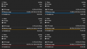
https://bugzilla.proxmox.com/show_bug.cgi?id=4618
I made a little comparison picture with (only) the yellow and red bar on the right modified as an example:

Liking the dark mode, but it seems that the default is always dark. While I appreciate, that PVE won't know the users preferences at the login page, when I log in, change back to light mode, log out then log back in again, Im back in dark mode.
Can the mode that's chosen be saved against the users record so that if light is chosen, then light is what you get when you log in?
Can the mode that's chosen be saved against the users record so that if light is chosen, then light is what you get when you log in?
We store that information in a Cookie. So unless you cleared that cookie or switch browsers, that should persist. At least if you log in or out again.Can the mode that's chosen be saved against the users record so that if light is chosen, then light is what you get when you log in?
The default (that gets applied when you don't set a preference manually) is to use the
auto theme. That theme switches the colors based on the preferes-color-scheme media feature. That can be changed either in your browser's settings or in your OS settings.There currently is no way to store such information on a per-user basis in Proxmox VE. So implementing this would require a new way of storing per-user preferences. However, there is already a feature request for setting a default theme per-user [2]. You can read the discussion there on why or why not such a feature would be implemented.
[1]: https://developer.mozilla.org/en-US/docs/Web/CSS/@media/prefers-color-scheme
[2]: https://bugzilla.proxmox.com/show_bug.cgi?id=4644
Understood. I do have dark mode set on my OS and presumably my browser has also adopted that and I probably won't change that, but as a web developer I'm always clearing my cookies and so the "saved" state is generally lost on a regular basis.
Dark Mode is a step in the right direction, but perhaps if I could request that its not tied to a cookie but to the users account in the future, that would be great. I wonder how popular that would be or whether my request is really an edge case.
It's a slight annoyance that I need to change back to light (my preference believe it or not) as my retinas haven't yet burned through.
Again, if you think this feature should exist, chime in over in our Bugzilla [2]. The more support a feature has over there, the more likely it is that we will implement. One great example for this is the dark mode itself.Dark Mode is a step in the right direction, but perhaps if I could request that its not tied to a cookie but to the users account in the future, that would be great. I wonder how popular that would be or whether my request is really an edge case.
[2]: https://bugzilla.proxmox.com/show_bug.cgi?id=4644
Last edited:
I like the color change between the lines. Makes it much easier to read those tables.
A small improvement in the UI would be to remove the table border and remove the color change on each line :
View attachment 49960View attachment 49961
There are a lot of other simple improvement to make a nice UI/UX but it doesn't seem to be a priority for the dev team
What is nice in your eyes, is not necessarily nice in the eyes of others. All subjective...
If you find things, that could be improved (for all users and not only for your own taste), e.g.: readability, then feel free to open a enhancement ticket:
https://bugzilla.proxmox.com
That was actually considered during the creation of the dark theme. However, we did not go down this path due two reason:There are a lot of other simple improvement to make a nice UI/UX but it doesn't seem to be a priority for the dev team
- Crisp (the light theme) uses lots of borders and alternating colors for rows in tables. We wanted to stay consistent with that and offer an option that would feel familiar to users of Crisp.
- As @Dunuin pointed out, this makes tables easier to parse. Alternating colors do help when it comes to differentiating between two adjacent lines. This is especially important in large tables with many differently sized columns.
As @Neobin pointed out, we are open to suggestions though. So you are welcome to open an issue in the bug tracker and provide an argument for why you want to see certain changes implemented.
Last edited:
Works fine here:

Ensure that you have fully reloaded the web UI with clearing caches, e.g., using
CTRL + SHIFT + R, or for macOS ⌘ + Alt + R.If that still doesn't help, please post your full
pveversion -v output (or copy it from the web UI: Node -> Summary -> Package Versions button) and tell us what browser/version you use.That does not look like our official dark mode. The colors in the header look more like Discord Dark [1]. We do not officially support Discord Dark, and our dark mode does break the way Discord Dark styles graphs (see [2]). So if you are using Discord Dark (or installed that previously) make sure to fully remove it. Then switch to the dark color theme via our theme picker and fully reload the website as described by @t.lamprecht.promlem 8.0.5
[1]: https://github.com/Weilbyte/PVEDiscordDark
[2]: https://github.com/Weilbyte/PVEDiscordDark/issues/160
Last edited:
People with dyslexia can struggle to track across lines of text, having the alternating line colours makes it a lot easier to do and reduces visual stress (as does dark mode).I like the color change between the lines. Makes it much easier to read those tables.


