Built-in Backup Regressions I've Noticed Since The Release of PBS

Lonnie

Renowned Member
Sep 16, 2014
80
6
73
I've been holding back a long time, but I've decided to go ahead and say what's on my mind.

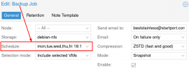
This is the most overloaded drop-down-menu I've ever seen and it needs to be changed back to how it was before! :
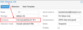
OverloadedDropDown.png

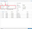
Instead of trying to use one drop-down to set "day of week" and "Start Time" (at the same time), please change this back to the way it was before. Where it was way more intuitive:
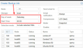
MultipleDropDown.png

I've noticed multiple regressions in the built-in backup utility since PBS was released. In addition to the regression above, now, each time I change the "Start Time" Proxmox tries to do a backup "right now" instead of waiting until the Start Time I've specified. I'm just trying to save a configuration with a new time, NOT "Save and Run Now"!

Another regression I've noticed, is that backups are no longer Rsync friendly (where my off-site backup only transferred the differences between the current backup and the last backup over the wire). Now it is as though some randomization technique has been employed to ensure that this weeks backup is vastly different (as far as rsync is concerned) than last week's backup (causing the whole file size to have to be transferred over the wire by rsync, instead of just the legitimate differences). Prior to the release of PBS, these offsite rsync backups would only be a few gigs. Now, they're hundreds of gigs.

I realize you guys would prefer that all proxmox users use Proxmox Backup Server (which is a fine product that everyone should consider), but please don't sabotage the built-in backup utilities as means of accelerating adoption of PBS.

Perhaps you're not doing any of this deliberately, but it is a terrible coincidence at the very least. I don't expect you guys to enhance the built-in backup utilities a whole lot, but will you please leave them as good as they were previously?
 

Attachments

  • OverloadedDropDown.png
    OverloadedDropDown.png
    92.9 KB · Views: 20
  • MultipleDropDown.png
    MultipleDropDown.png
    313.5 KB · Views: 19
Last edited:
Using large and bold fonts makes your post very unpolite and hard to read.

If you think that the menu contains an error you‘re free to contribute at the bugtracker.
 
  • Like
Reactions: Neobin and Spirog
On my 4K displays, those fonts looked perfect. Never the less, I've shrunken them down as requested. The screenshots probably look magnified too (due to 4K capturing twice as many pixels as is typical). Hopefully, it is at least readable now. @Huch @Spirog
 
  • Like
Reactions: Spirog
This is the most overloaded drop-down-menu I've ever seen and it needs to be changed back to how it was before! :
No, we won't change it back and take away much needed flexibility that the Proxmox community requested since years, the old format only allowed a fraction of the use case possible now and required multiple jobs for the simplest things, e.g., repeating the schedule once every few minutes or hours.
The format is the systemd calendar events format, nowadays widely used and available on any Linux distribution using systemd
https://www.freedesktop.org/software/systemd/man/systemd.time.html#Calendar Events
https://pve.proxmox.com/pve-docs/pve-admin-guide.html#chapter_calendar_events

The combo box isn't really a combo box, it only shows a few common examples to get one going.

Your example could be also made shorter, e.g., as mon..fri 18:10

In addition to the regression above
Above isn't a regression.

, each time I change the "Start Time" Proxmox tries to do a backup "right now" instead of waiting until the Start Time I've specified. I'm just trying to save a configuration with a new time, NOT "Save and Run Now"!
This behavior can be indeed unideal and is tracked under https://bugzilla.proxmox.com/show_bug.cgi?id=4053 (slightly different symptom, same cause)

Another regression I've noticed, is that backups are no longer Rsync friendly (where my off-site backup only transferred the differences between the current backup and the last backup over the wire). Now it is as though some randomization technique has been employed to ensure that this weeks backup is vastly different (as far as rsync is concerned) than last week's backup (causing the whole file size to have to be transferred over the wire by rsync, instead of just the legitimate differences). Prior to the release of PBS, these offsite rsync backups would only be a few gigs. Now, they're hundreds of gigs.
The VMA format was never really that rsync friendly, and more importantly, we didn't change that a bit in the last years, neither for PBS development nor for other reasons.

I realize you guys would prefer that all proxmox users use Proxmox Backup Server (which is a fine product that everyone should consider), but please don't sabotage the built-in backup utilities as means of accelerating adoption of PBS.
We don't sabotage anything. vzdump and VMA is here to stay, that was made clear early in releasing PBS as beta, and we don't want to make our own life harder by botching something, definitively not our own software. But, as we're open source and all changes are in the git commit log and can be verified, you can also reassure yourself.
 
@t.lamprecht

First of all, thank you for directly addressing each of my concerns/speculations.

While the UI may not be a regression in terms of flexibility, it is certainly a regression in terms of intuitiveness. Previously, without reading any documentation (and without any worry of malformed syntax), I could schedule a backup to be performed on any combination of days during the week, at the same time on each of those days (point and click -- no keyboard). Now, each time I modify the schedule, I have to re-read forgotten documentation to ensure I achieve doing it correctly.

Previously, the burden of understanding syntax was handled 100% by the developer who designed the UI. The new design shifts that burden onto the end user. Perhaps this is the nature of flexibility; it adds complexity. However, I'm certain that it is possible to offer the same level flexibility (provided by recent changes) without having the user type syntax into a web browser. I'll give this more thought, as I am a full stack developer myself. If I discover a way to abstract this flexibility (to the level of intuitiveness achieved in prior versions), I'll make a contribution to the code base.

Until then, for what it is worth, I recommend placing an info-link directly into the UI, that opens a new tab to the documentation you sited. This will (at least) direct the user immediately to the information they need to successfully configure their desired schedule (information that wasn't needed at all before).

Thank you for the link that will allow me to track progress on the issue with "backups 'running now' upon making changes". It is good to know that this is a known issue that will likely be addressed in the future.

I believe you that the team hasn't done anything to deliberately make backup files less rsync-friendly. However, I stand behind my claim that, since version 7, ownership changes, and the release of PBS, PVE's built-in backups have been dramatically less rsync-friendly. I accept that this is merely an unintended coincidence.
 
Last edited:
Only option I would see that satisfies easy use and flexible syntax would be to show the two old weekday/time dropdowns like prior to PVE 7.1 and an empty textfield for writing down a calender event format for advanced users. You then could directly write down your calender event format string in the textfield or you use the two dropdowns where some javascript could convert the dropdown selection combination into a calender event format string that is then added to textfield. That way the calender event format will be always used but people don't need to understand the syntax for simple schedules.

But then people probably get confused because the form is more overloaded...

...on the other hand...UI isn't that intuitive yet anyway as people always ask in the forums why they cant select a day or time in that dropdown because they dont get that the dropdown only shows examples and that you can an should type your own text matching the syntax there.
The 'editable' default text is a nice hint but people still don't get that this is also a textfield and not just a simple dropdown with only predefined options.

Stopped counting how often I needed to explain people that you are not limited to the predefined options.
 
Last edited:
  • Like
Reactions: Lonnie
once you try proxmox backup server side by side with pve, (not recommended because backup is on same host but works same as backup to local disk...) you can't back.
it's fast, incremental, another datastore can be sync from primary datastore (like rsync) all wanted features imho.
 
once you try proxmox backup server side by side with pve, (not recommended because backup is on same host but works same as backup to local disk...) you can't back.
it's fast, incremental, another datastore can be sync from primary datastore (like rsync) all wanted features imho.
And 20 PBS backups of each guest consumes less space here than a single Vzdump backup + several ZFS snapshots per guest. So you can keep way more backups while still saving backup space. Totally love PBS deduplication and it even don't need lots of RAM like ZFS deduplication.
 
Last edited:
  • Like
Reactions: _gabriel
I realize you guys would prefer that all proxmox users use Proxmox Backup Server (which is a fine product that everyone should consider), but please don't sabotage the built-in backup utilities as means of accelerating adoption of PBS.
There's no doubt that PBS is superior, but prior to PVE 7, my automated rsync offsite backups were reasonably efficient.

After PVE 7.0, it doesn't matter if the backup file is a compression of none, LZO, GZIP, or ZSTD; all of them seem to be either "randomized or encrypted" (at a low level) to where even if you only change one character of a text file (within a vm between backups) rsync now needs to transfer the entire backup file instead of only transferring that one character of difference!

A "raw" backup with zero compression shouldn't be that astonishingly different between offsite backups. I cannot emphasize this enough. I desperately desire an rsync-friendly compressed backup option within PVE7's list of options. For example, it would be great if something like this was an available option right there in the web interface. Again, prior to PVE7, rsync worked great for off-site backups. If it never did work, I'd have nothing to complain about. I only complain when good stuff vanishes and I don't like complaining about it, believe me.

This post is not comparing PBS with PVE's built-in backup. PBS's quality was granted upfront. Instead, it is comparing the rsync-friendliness of PVE 7.0 to the rsync-friendliness of all prior versions: Exponential different degrees of rsync-friendliness.

Perhaps the changes in PVE 7 were necessary in order for PBS to work so efficiently at backing up Proxmox VMs. If so, I consider that a legitimate reason. Yet, does this have to be mutually exclusive? Can there not also be an option like this in the web interface's drop-down menu of PVE7?
 
Last edited:
rsync vzdump raw can be done only when VM are "fresh", when VM shift disk data or defrag, rsync must change many parts.
this why pbs was created. output backup of pbs is rsync friendly because same data is stored in chunk by md5 value. if you clone your vm, and backup the clone. backup to pbs will be fast because all/many blocks/chunks already exist in backup destination. same if your rsync datastore manually to another destination. but there is a Sync option built in pbs which replace rsync.
be sure I like very much rsync and I use it for remote backup at files level on Windows host, for PST, BAK of MDF, Hfsql..
But for whole file system, it can't be efficient. it's nothing to do with pve, it's same for all hypervisors.
 
  • Like
Reactions: Lonnie
Only option I would see that satisfies easy use and flexible syntax would be to show the two old weekday/time dropdowns like prior to PVE 7.1 and an empty textfield for writing down a calender event format for advanced users. You then could directly write down your calender event format string in the textfield or you use the two dropdowns where some javascript could convert the dropdown selection combination into a calender event format string that is then added to textfield. That way the calender event format will be always used but people don't need to understand the syntax for simple schedules.

But then people probably get confused because the form is more overloaded...
I really like this idea. Keep the drop-downs from before, and provide a textfield for advanced configuration. That would be more intuitive, because the UI would handle syntax transparently. The advanced textbox could be empty or contain a sensible default. Many users would be able to serve their own needs without needing to touch it. A info-link ⓘ could be placed beside the advanced textbox, that when clicked, opens a new tab for quick documentation reference. This would be a nice touch for anything that isn't intuitive.
...on the other hand...UI isn't that intuitive yet anyway as people always ask in the forums why they cant select a day or time in that dropdown because they dont get that the dropdown only shows examples and that you can an should type your own text matching the syntax there.
The 'editable' default text is a nice hint but people still don't get that this is also a textfield and not just a simple dropdown with only predefined options.

Stopped counting how often I needed to explain people that you are not limited to the predefined options.
I love this feature and wish the HTML standard provided this functionality natively (so that I'd encounter it more frequently in other web applications).

It may not be expected by first-time users, but once they know it, its easy to remember its there. I consider this an excellent innovation and my hat is off to whoever thought that up.

If form fields had info-link ⓘ beside them, documentation could always reiterated this wonderful innovation that you've had to explain over an over again. Some people won't read those either, but some will.
 
Last edited:

About

The Proxmox community has been around for many years and offers help and support for Proxmox VE, Proxmox Backup Server, and Proxmox Mail Gateway.
We think our community is one of the best thanks to people like you!

Get your subscription!

The Proxmox team works very hard to make sure you are running the best software and getting stable updates and security enhancements, as well as quick enterprise support. Tens of thousands of happy customers have a Proxmox subscription. Get yours easily in our online shop.

Buy now!