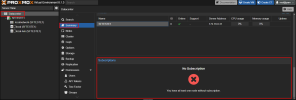
How to remove subscription widget ?
- Thread starter jeffhmelo
- Start date
-
- Tags
- subscription summary
You are using an out of date browser. It may not display this or other websites correctly.
You should upgrade or use an alternative browser.
You should upgrade or use an alternative browser.
You can do so by getting a subscription: https://www.proxmox.com/en/proxmox-ve/pricingI need help removing the subscription widget from the data center summary.
It won't show an error if you get a subscription.I don't have a subscription, but I don't want the subscription widget to appear.
It's fine if you won't get any, but then you have to live with the few small reminders in the UI.
Note also that this is the official Proxmox community forum, not the best place to ask for advice how to circumvent reminders that are part of ensuring that our project gets enough funding to provide and maintain a powerful hypervisor solution..
Please keep the nagscreen! Its a really small price to pay for a homelab environment!
And If you use it commercialy, the prices are so low (at least for now) every business shoult be able to afford at least a basic license to support the Proxmox Team at least a little bit!
Keep up your great work!
And If you use it commercialy, the prices are so low (at least for now) every business shoult be able to afford at least a basic license to support the Proxmox Team at least a little bit!
Keep up your great work!
While I personally have nothing against this widget in the UI, had the repo be called e.g. non-production (if you absolutely do not want to call it test), it would do its job. Then a warning at all times: "you are running off non-production repo" would be just fine, including e.g. constant banner on top. In fact it could even be on top of the SUMMARY page.
Now after fresh install, one has to manually change repos away from enterprise to get any updates. That's manual enough process and this widget prominent enough to accept that those who can purchase a subscription, will. Those with ansible deployments etc, will do away with any UI element without a hitch anyways.
(Small note on signalling: RED is usually an ERROR. If one is set on other than enterprise repo, they do not encounter any error, they should be shown e.g. ORANGE warning instead.)
Do you really believe this is a good idea???Edit /usr/share/pve-manager/js/pvemanagerlib.js
Do you really believe this is a good idea???
I think for that low amount of money it costs to get the smallest subscription, you could buy that...... else be proud of the proxmox team that they keep the community spirit as high as the free software spirit and take the non-sub-badge as a present
Cheers
4920441
this is no news at all.... don't feel special about it. it is only very inappropriate to post something like this in the Proxmox forum directly and - whats even worse - be proud of it.....Whiny bunch, i'll post the answer to his question elsewhere, bye.
Remeber: EVERYTHING IS OPEN SOURCE, so any idiot can patch that out if he wants to - so, don't feel too special about it.... it's not a real achivement at all.
Of pay for a support subscription so that the source stays free as well as open.
Why is it inappropriate? If you use Proxmox for production, surely you would want a subscription. If you use it as a homelab, there is no profits to share and no need for the benefits a subscription gives you. So why look at a red cross that draws attention every time you look at the summary?this is no news at all.... don't feel special about it. it is only very inappropriate to post something like this in the Proxmox forum directly and - whats even worse - be proud of it.....
Remeber: EVERYTHING IS OPEN SOURCE, so any idiot can patch that out if he wants to - so, don't feel too special about it.... it's not a real achivement at all.
Nothing to be proud about, you are right about that. I wasn't proud about it though.
Just if someone asks a question, multiple people reply to it without giving the answer, while they probably could provide the answer.
If it is a good idea is not the point either. That is upto the person asking the question in the first place to decide.
No one is disadvantaged by it anyways.


