Automatically-scaled graphs are great for specific use-cases, but they can require extra mental processing when doing visual scanning.
For example: A VM using 0.2 CPU with regular peaks of
Examples:
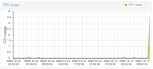
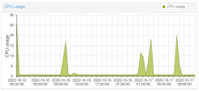
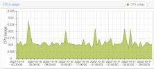
Without looking at the numbers, it's very difficult to understand which is using more resources.
It would be helpful to have a 'graph scale' control right next to the dropdown that contains 'Month (average)', or even in the "
That way we could set
For example: A VM using 0.2 CPU with regular peaks of
0.3 looks like it's using more CPU than a VM using 0.4 with a single peak of 1.2.Examples:


Without looking at the numbers, it's very difficult to understand which is using more resources.
It would be helpful to have a 'graph scale' control right next to the dropdown that contains 'Month (average)', or even in the "
..." menu for each graph.That way we could set
Auto, 0-100%, or maybe even an arbitrary scaling such as 0-0.05 for tracking down specific issues.
