

PDM 1.0.1 highest usage bars are bad readable
- Thread starter czechsys
- Start date
You are using an out of date browser. It may not display this or other websites correctly.
You should upgrade or use an alternative browser.
You should upgrade or use an alternative browser.
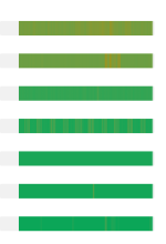

i get what you mean, but it's hard to auto generate proper colors when the actual metric is a gradient, so we go from green to yellow to red, but since cpu and memory are on a scale, we have to fade between the colors to have some kind of difference for the most part.
i'll see if we can set the color anchor points better, or if I have some other idea to better visualize that
i'll see if we can set the color anchor points better, or if I have some other idea to better visualize that

In my view, you can either change the color scheme, or if you want gradient, you can just forget the green and instead of using green just use either black or white. White when using dark theme, block when using light theme, or simply use black w/ white border or white w/ black border regardless of what the theme the user is using. Just a thought.
I 100% agree with @czechsys, most of this just looks like green solid bars with some hard-to-see red lines on them to me. I didn't even realize they changed with a gradient value until it was pointed out here. My host with the most resources being used is a little less green than the others. Maybe this looks very different when resources are low, and perhaps that is the point. But overall, it's hard to see what values these bars represent in a healthy environment, unless I hover over them.
