Display bug in the left VM / CT list

m-electronics

Member
Jan 12, 2022
60
2
13
25
I think I have found a bug since PVE 8.4.16 and also in PVE 9.1.2:

In the left bar / list, where all VMs are listed, the tags are not displayed well when they are too long to the actual width.
No scroll bar appears and they are cut off and 3 dots are displayed.
Is this a new display design or a bug?
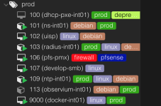
Screenshot 2026-01-01 at 19.21.17.png
 
That is intentional. You do not want your UI cluttered with too many tags. These tags are not ment to replace your inventory management :)
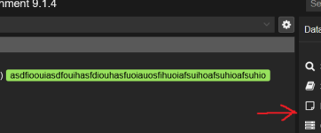
Also, you can use the vertical bar to the right of your tags to extend the visible area:

1767293146921.png
 
Last edited:
  • Like
Reactions: UdoB
Yes, I know that I can resize the visible area, but I think it would be better when a scroll bar appears (how it was in the earlier versions) and you can scroll to see the other tags...

You do not want your UI cluttered with too many tags.
That can be true, but I use the tags to label what OS is running in the VM / LXC and to which network the VM is attached...

Why it was changed? ;)
And I don´t have an inventory management in my homelab. Do you know someone that is open-source and can be self-hosted? :)