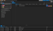
Yes, that makes more sense indeed. Maybe a simple "not-a-perfect-translation"-bug.In the CLI [1], the "add" command still confuses me, I believe it should be called "join".
Concept thoughts for improving the Proxmox VE web interface :)
- Thread starter justinclift
- Start date
You are using an out of date browser. It may not display this or other websites correctly.
You should upgrade or use an alternative browser.
You should upgrade or use an alternative browser.
Is there a BZ requesting that addition to the GUI?With a round-robin served DNS A record, you can see e.g. "pve.internal" and it could be any of the dozen nodes there.
Is there a BZ requesting that addition to the GUI?
No, but I was now accused of spamming BZ because I requested users to e.g. see why their machine is not booting [1], so as you can imagine I am sparing my BZ shots at e.g. core services or security, not GUI now.
But I absolutely encourage everyone who wants to improve the state of things to contribute to bugreports, if nothing else at least to +themselves to the Cc list, it is simply very different when a report has 2 or 20 people who follow.
(Do not get dissuaded, I have thick skin and they know it, you will get nicer treatment.
[1] https://bugzilla.proxmox.com/show_bug.cgi?id=5767
or provide patchesBut I absolutely encourage everyone who wants to improve the state of things to contribute to bugreports
I just saw this now ... round robin will not work that well, the cookies will not match and you'll probably have to relogin and ask yourself, why this is the case. Best to use a reverse proxy with sticky sessions, so that the reverse proxy will now where you've been routed before. There are a couple of threads discussing this.With a round-robin served DNS A record, you can see e.g. "pve.internal" and it could be any of the dozen nodes there. Similar with reverse proxy. Similar with every post on this forum with a "screenshot" that does not include address line.
or provide patches
Yeah, well, they rejected mine once and took users for fools too. But, sure.
I just saw this now ... round robin will not work that well, the cookies will not match and you'll probably have to relogin and ask yourself, why this is the case. Best to use a reverse proxy with sticky sessions, so that the reverse proxy will now where you've been routed before. There are a couple of threads discussing this.
It's a good point for RR, but this is a matter of timeout and what you expect. I think the OP was talking of GUI alone (adding nodename).
Um, wasn't adding something to show which node the browser is connecting to your idea @esi_y?I think the OP was talking of GUI alone (adding nodename).
Unless that's not what you're meaning, or I really need more coffee?
Last edited:
Um, wasn't adding something to show which node the browser is connecting to your idea @esi_y?
On this thread? Yes. I am sure I am not the only one. But I thought you were specifically asking if BZ has been made for that GUI, not asking about some official Proxmox RR setup...
I've been going through that Youtube video again, breaking out the bits that seem sensible to me into appropriate pieces for BZ's:
- Folder/subfolder support → https://bugzilla.proxmox.com/show_bug.cgi?id=5776
- Allow spaces and other characters in the VM/container names → https://bugzilla.proxmox.com/show_bug.cgi?id=5777
- Allow selecting and editing multiple VMs/containers at the same time → https://bugzilla.proxmox.com/show_bug.cgi?id=5778
- System Health status pane in the Node "Summary" view (and prob similar in the VM/container "Summary" view) → TBD
- Move the node vertical submenu to be horizontal, then reorganise the Summary view to be more compact → TBD (maybe)
- Not sure if I'll make a BZ of this one. @esi_y already pointed out that this is how the Proxmox webUI used to be back in 2015.
- "Export to CSV" functionality → https://bugzilla.proxmox.com/show_bug.cgi?id=5788
Last edited:
BTW I just realised, I had filed some GUI related BZ, in the past:
https://bugzilla.proxmox.com/show_bug.cgi?id=5056
So if anyone finds THAT useful, I invite you all to support it too.
https://bugzilla.proxmox.com/show_bug.cgi?id=5056
GUI does not provide any warning on lost quorum situation, but severely limits e.g. access to shell, also proxying connections to other nodes without clear error message (those are generic failures of termproxy).
So if anyone finds THAT useful, I invite you all to support it too.
The part of the video where Rich is suggesting changes to the (node, vm) summary view seems to be getting misunderstood in this discussion:

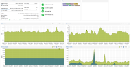
The Summary interface change isn't removing any information. Instead it's condensing part of the layout (the text heavy bit), adding a "System Health Status" piece, and moving the single column of vertical charts to be two columns instead. The two columns of charts fits into the default sized view a bit easier, to show everything all at once:This might be good to reduce "function overload" for newcomers and non-technical staff that audits/uses only a small set of Proxmox VE's functionality, but for all power users it would be a big disruption of their workflow experience.
One IMO more realistic idea to solve this without interfering with power/long-term users is adding a new "simple view" which reduces what's visible by default on the user interface to the minimum, like basic load and health overviews of nodes, guests and tasks (like backup) and guest management (start/stop, migrate).

Last edited:
The update part is easy and already there ... everything else is not determinable from the hypervisor. You need integration into the hardware (this is done on other hypervisors with software from the hardware vendor, I don't see that happending for PVE), VM and container health ... how is that even defined??? As said numerous times before, get a decend monitoring solution, PVE will not and cannot provide this."System Health Status"
This is a typical homelab request and PVE is not about homelabbing. You will not go to a webpage to check for your system health, you want proactive monitoring that informs you about stuff.
This is a typical homelab request and PVE is not about homelabbing.
Idk, OP is former contributor to PostgreSQL. It's alright not everyone agrees with everything, but denigrating others' ideas alone is a bit over-protective of status quo. What you mentioned as your rationale is partially correct for HW (but of course failed disk is something OS knows about), but of course it would be possible to show on summary e.g. failed migration or LXC failing heartbeat check (definable by user).
Last edited:
Not sure how accurate that is. The guy making the Youtube video with the screenshots and stuff is coming at this from a decent VMware vSphere/ESX background.This is a typical homelab request
So I'd expect that to be where he's getting the idea from and is surprised Proxmox doesn't do it as well.
Last edited:
Heh, my PG efforts in recent days are mostly here as the PostgreSQL project doesn't yet really have a handle on Docker stuff:former contributor to PostgreSQL
https://github.com/pgautoupgrade/docker-pgautoupgrade
- Folder/subfolder support → https://bugzilla.proxmox.com/show_bug.cgi?id=5776
- Allow selecting and editing multiple VMs/containers at the same time → https://bugzilla.proxmox.com/show_bug.cgi?id=5778
The above two functions are very good, I hope PROXMOX will consider supporting them
Somewhat related to this something I wanted for a while, copying over a vimwiki entry from over a year ago:
- System Health status pane in the Node "Summary" view (and prob similar in the VM/container "Summary" view) → TBD
- [ ] Health Scanner Support
- [ ] Create a job type for health scanning
- [ ] add various checks that could be relevant
- [ ] Factor out some pveXtoY checks
- [ ] Storage nearly full?
- [ ] Any failed task in the last X hours/days
- [ ] No repository configured
- [ ] Pending updates but not applied for X hours/days/week
- [ ] ...?
- [ ] Send out notification with health state and simple ok/warn/err state to allow filtering to only get a notification if something is off.
- [ ] Create GUI to view various health check results, e.g. cluster wide under "Datacenter" for easy overview
I'd not do this at VM/CT level, there we have little info available about health and one already sees the general usage. IMO it's more relevant to get a quick high-level view of things that are, or might be, off, especially on bigger setups.
Users with monitoring setup would probably not get much new info from this, but there might be some PVE specific things that common monitoring (plugins) miss, and it can be still nice to check the last result from the last scan in the PVE interface directly.
The submenu won't change anytime soon, when users are not happy about that it often correlates with they're having used other hypervisors for a while and now checking out PVE; but we're not a copy and do not want to be one. Our reasoning for moving to this layout is, among other things, better space usage overall, especially with the more navigation entries we gain and also less mouse movement required after selecting the datacenter, a node or a virtual guest and then choosing a sub-panel.Move the node vertical submenu to be horizontal, then reorganise the Summary view to be more compact → TBD (maybe)
- Not sure if I'll make a BZ of this one. @esi_y already pointed out that this is how the Proxmox webUI used to be back in 2015.


