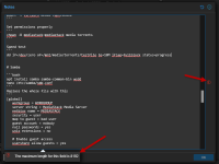
I use this notes section more than anything else. I keep notes on what I did to set things up, how to fix issues as they arise on the guest, links to all kinds of things, etc. etc...
But It is so tiny that a lot of the time I just click "edit" and view it as raw markdown. That little button is backwards; it shrinks the whole panel instead of expanding it IMHO.
PLEASE make this a first class citizen and give it the space and polish it deserves. It would be really great if you could have more CSS for the blocks (and support the extra tags like ```bash or ```yaml or things like that) and also distinguish > as an inset little quote area... basically make it nice and colorful and look like Github does (example here https://github.com/microsoft/markitdown ).
It would be fantastic if I could drag the boxes around and resize to my own preference order. For me, I'd want the Notes to take up that whole left side column (both top and bottom. Then I'd put the stats (CPU,RAM,etc) as a block on the right side top. I'd make CPU and RAM as 1/2 sizers under that and network and disk same thing... or maybe those four as 1/4 sizers and click on them to expand them or something so i can have a quick overview and drill into something that seems high real quick.


But It is so tiny that a lot of the time I just click "edit" and view it as raw markdown.
PLEASE make this a first class citizen and give it the space and polish it deserves. It would be really great if you could have more CSS for the blocks (and support the extra tags like ```bash or ```yaml or things like that) and also distinguish > as an inset little quote area... basically make it nice and colorful and look like Github does (example here https://github.com/microsoft/markitdown ).
It would be fantastic if I could drag the boxes around and resize to my own preference order. For me, I'd want the Notes to take up that whole left side column (both top and bottom. Then I'd put the stats (CPU,RAM,etc) as a block on the right side top. I'd make CPU and RAM as 1/2 sizers under that and network and disk same thing... or maybe those four as 1/4 sizers and click on them to expand them or something so i can have a quick overview and drill into something that seems high real quick.


Last edited:


